In this blog we will touch base on screen design and design patterns for screens. Patterns refers to the development of user interface and page composition. It is important to understand that the patterns used when designing for different screens, will be different on all devices. When designing a user interface, it is best to start off with a smartphone, as its smaller design will force you to prioritise, and will minimise the difficulties when adopting a large screen pattern for a smaller device. In the book A Pattern Language by Alexander (1977, p.15) he states “…each pattern represents our current best guess as to what arrangement of the physical environment will work to solve the presented problem”. Though it is important to understand that they are just patterns, they may solve a design problem, or they may not, it all depends on the problem at hand.
Nowadays is easy to decipher a responsive website made on applications such as WordPress, as they become notably similar in UI pattern proliferation. Which makes it harder for innovation in design, though usually creates a smooth and easy experience. Recognisable patterns include:
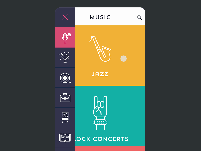
1 – The Hamburger Menu

The Ultimate Guide to the Hamburger Menu and Its Alternatives [Image] (N/A). Retrieved March 28, 2019, from https://uxplanet.org/the-ultimate-guide-to-the-hamburger-menu-and-its-alternatives-e2da8dc7f1db
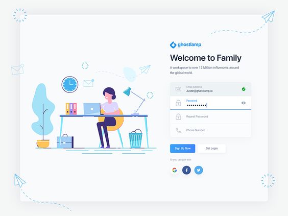
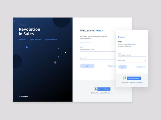
2 – Account Registration
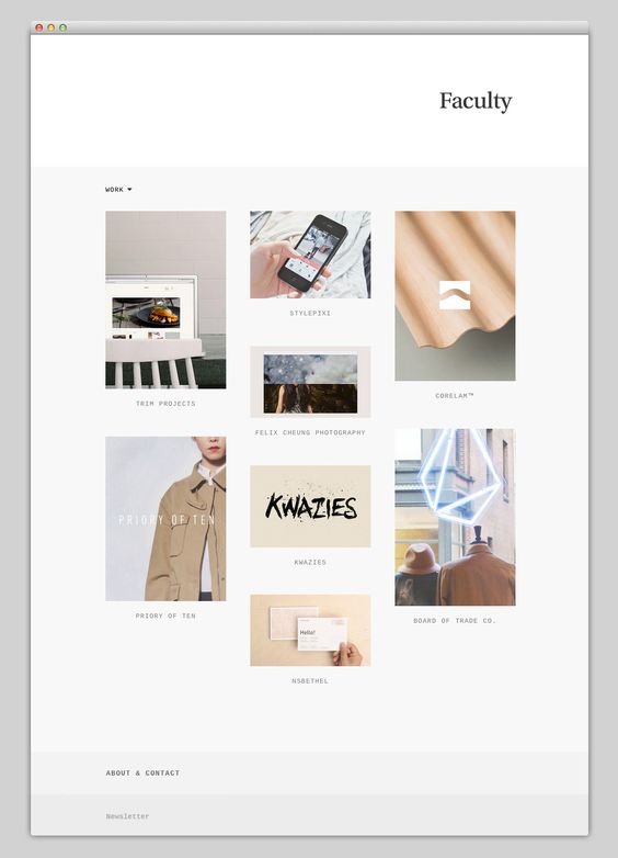
3 – Long Scroll
Mindsparkle Mag [Image] (N/A). Retrieved 28, 2019, from https://mindsparklemag.com/
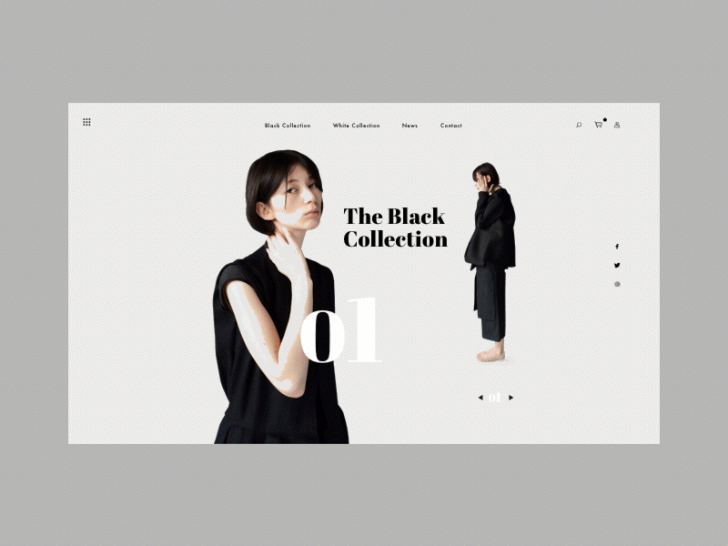
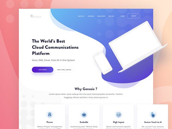
4 – Card Layouts
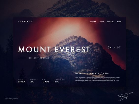
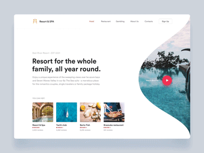
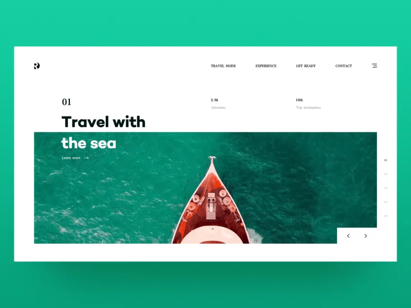
5 – Hero Image
6 – Animation
Loading Animation

Navigation and Menus (non-scrolling) Animation
Galleries and Slideshows

Motion Animation
Scrolling Backgrounds Animations/Videos
7 – Material Design
8 – Responsive Design & Flat Design
It’s important to not follow trends just cause it’s the new cool thing, but to use trends for a better experience for your users.
 Amie's Blog