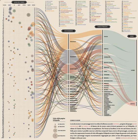
Interactive Digital Media
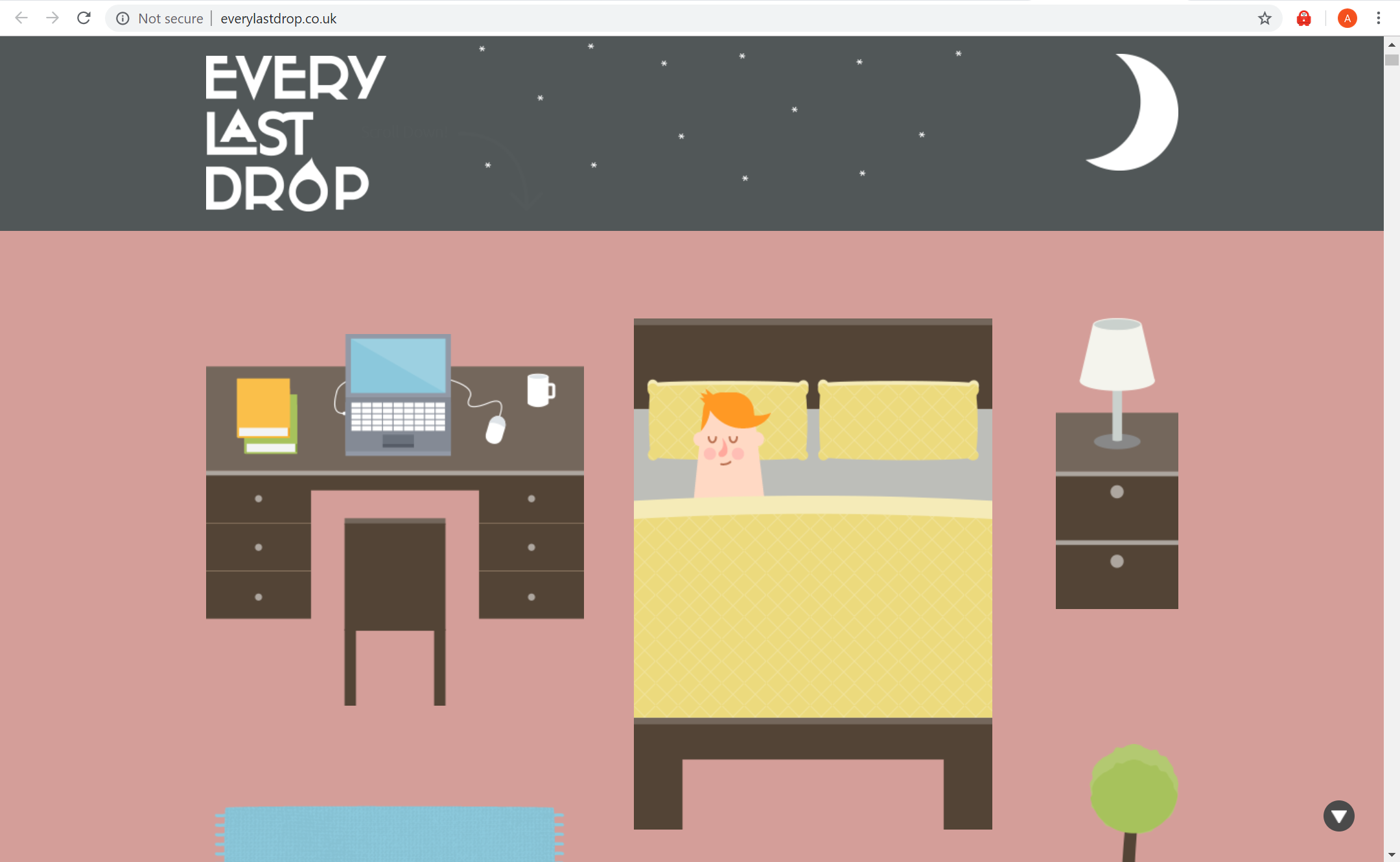
Every Last Drop Nice and Serious. (n.d.). Every Last Drop – An Interactive Website about Water Saving. Retrieved from http://everylastdrop.co.uk
What is the interactive about?
– This interactive website informs people about how much water is wasted daily
– Includes ways to reduce the amount of waste being made
– Provides short yet informative points (gets straight to the point)
– Places emphasis on why “every last drop” counts
– Informs that water isn’t just wasted on showers or washing the dishes, but is also wasted in other areas in our lifestyle – water is wasted depending what brand of clothes you buy or even the type of food you eat.
Who is it designed for? (Target Audience)
– The website is designed for any age as the text is only of a few words and the interactive animation visually helps the audience to understand the fundamental points of water waste.
– particularly useful for a younger audience as the colours and simple illustrations help convey the meaning in a clear and interesting way. Though it’s combination of illustration and factual text makes it a useful website for all
What knowledge does it assume of the target audience i.e. digital literacy?
- They assume the audience is able to read
- Have access to a computer and be able to correctly use it
- The knowledge of what an average morning routine looks like
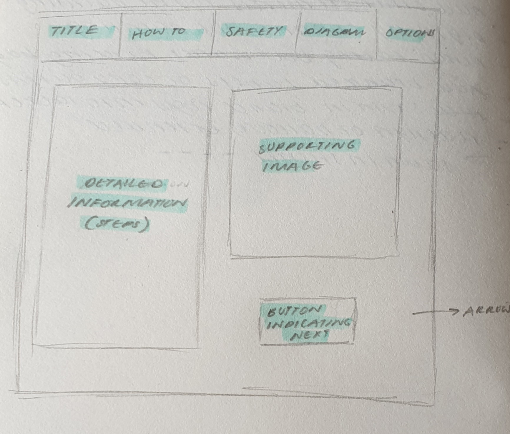
Describe the type of user interactions, and the user interface.
– User must scroll down the page to see the sequence of information being portrayed
– Each time the user scrolls down the page animations from a scene disperse and then form together to create the next scene
What can you say about the visual design – layout, colour, and typography? How would you describe the style?
– The style of this website is heavily made in an illustrative style, or cartoon like animation as the objects created are very simple
– The layout is user friendly on all devices. The layout is also very simple as the user only interacts with the website by scrolling
– The colours are vibrant and fun, making it interesting to look at and appealing to the eye.
– The typography is simple and easy to read. The typography changes with each scene to suit the environment
What improvements would you suggest?
– A clearer understanding of how to navigate through this website, i.e. a more striking and noticeable arrow or sign directing the user to scroll down.
– Improvement would be having an introduction or brief story into what the user is about to be reading
– The facts could be expanded and more information about how and why so much water is lost
– Provide the user with a deeper understanding as to why it is so beneficial. I.e what are the long term impacts of wasting so much water?
– more specific information could be added to teach the audience how to lower their water usage
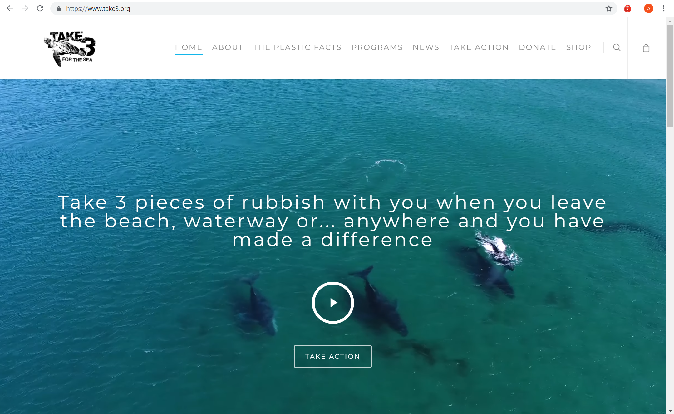
Take 3 for the Sea Take Action. (n.d.). Retrieved from https://www.take3.org/take-action/
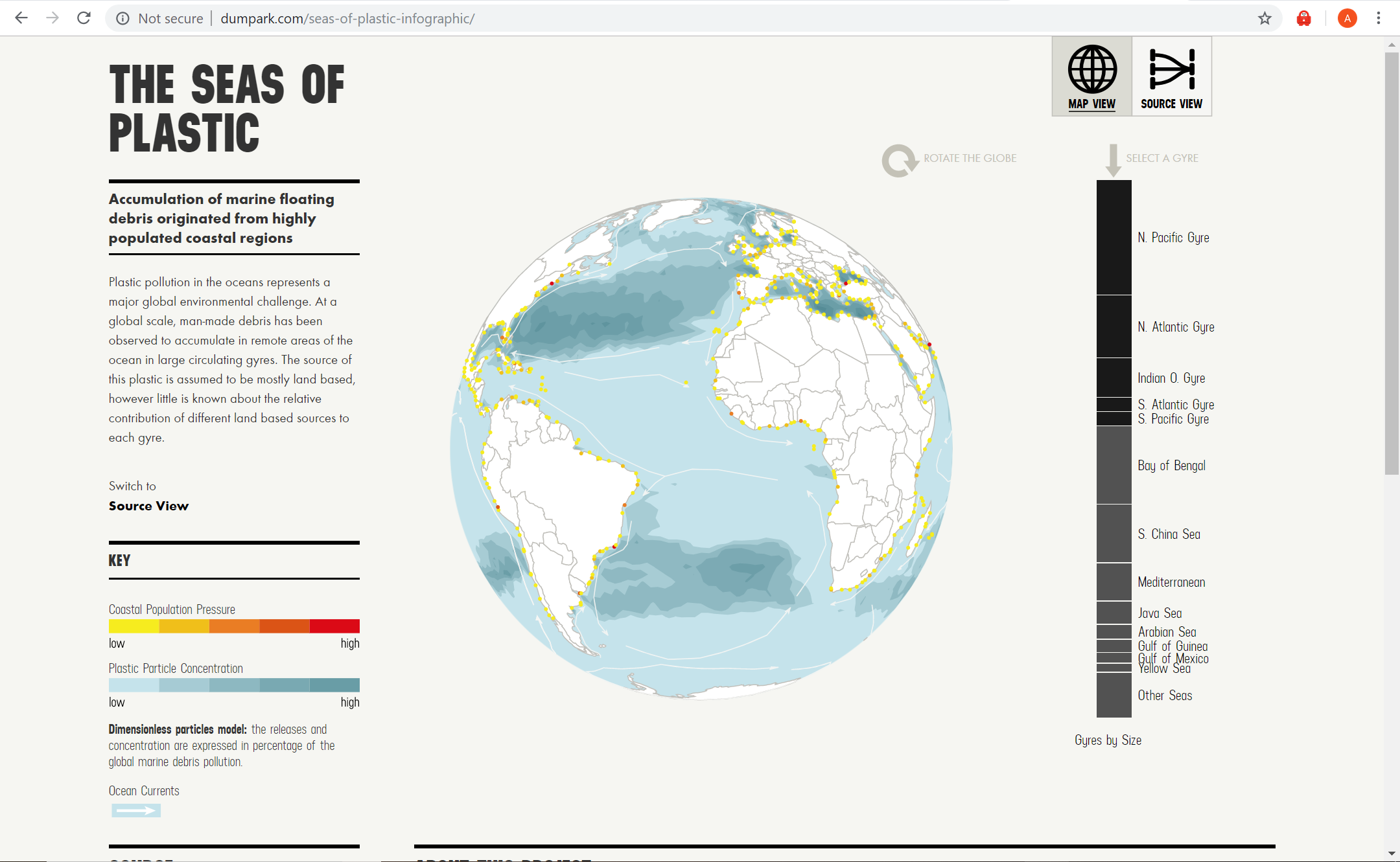
The Sea of Plastic The Seas of Plastic Interactive. (n.d.). Retrieved from http://dumpark.com/seas-of-plastic-infographic/
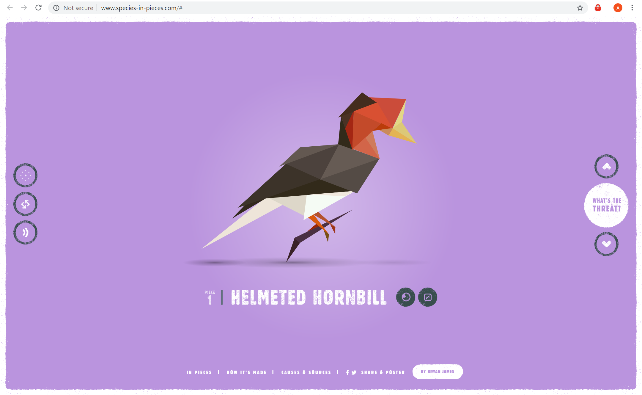
Species in Pieces In Pieces. (n.d.). Retrieved from http://www.species-in-pieces.com/#
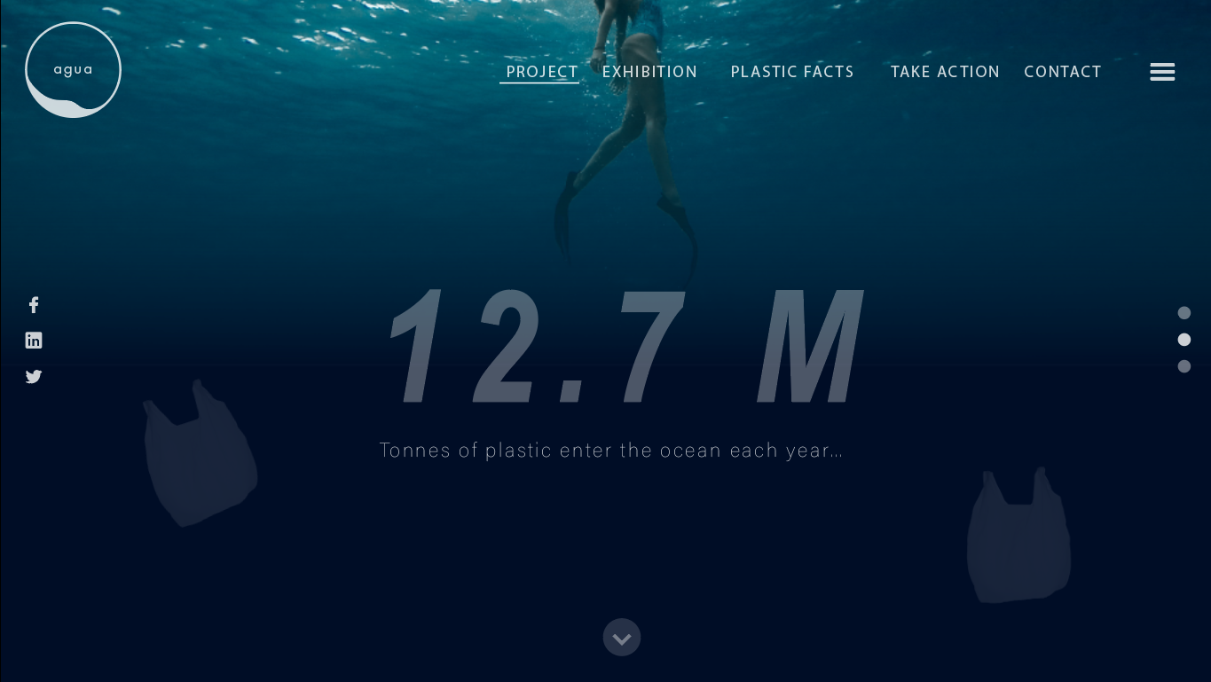
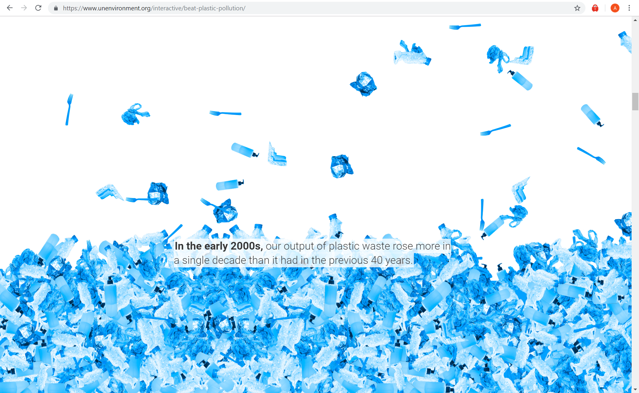
Our planet is drowning in plastic pollution. This World Environment Day, it’s time for a change. (n.d.). Retrieved from https://www.unenvironment.org/interactive/beat-plastic-pollution/
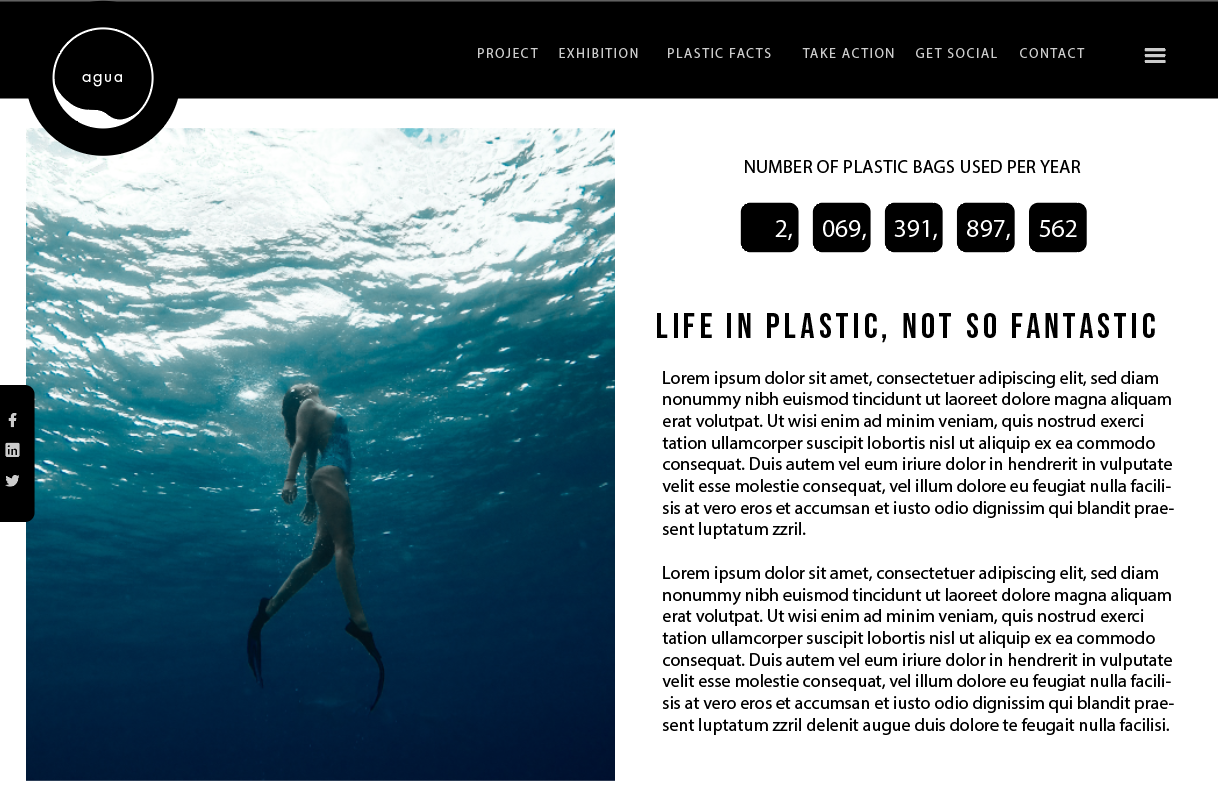
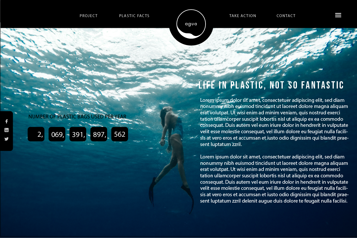
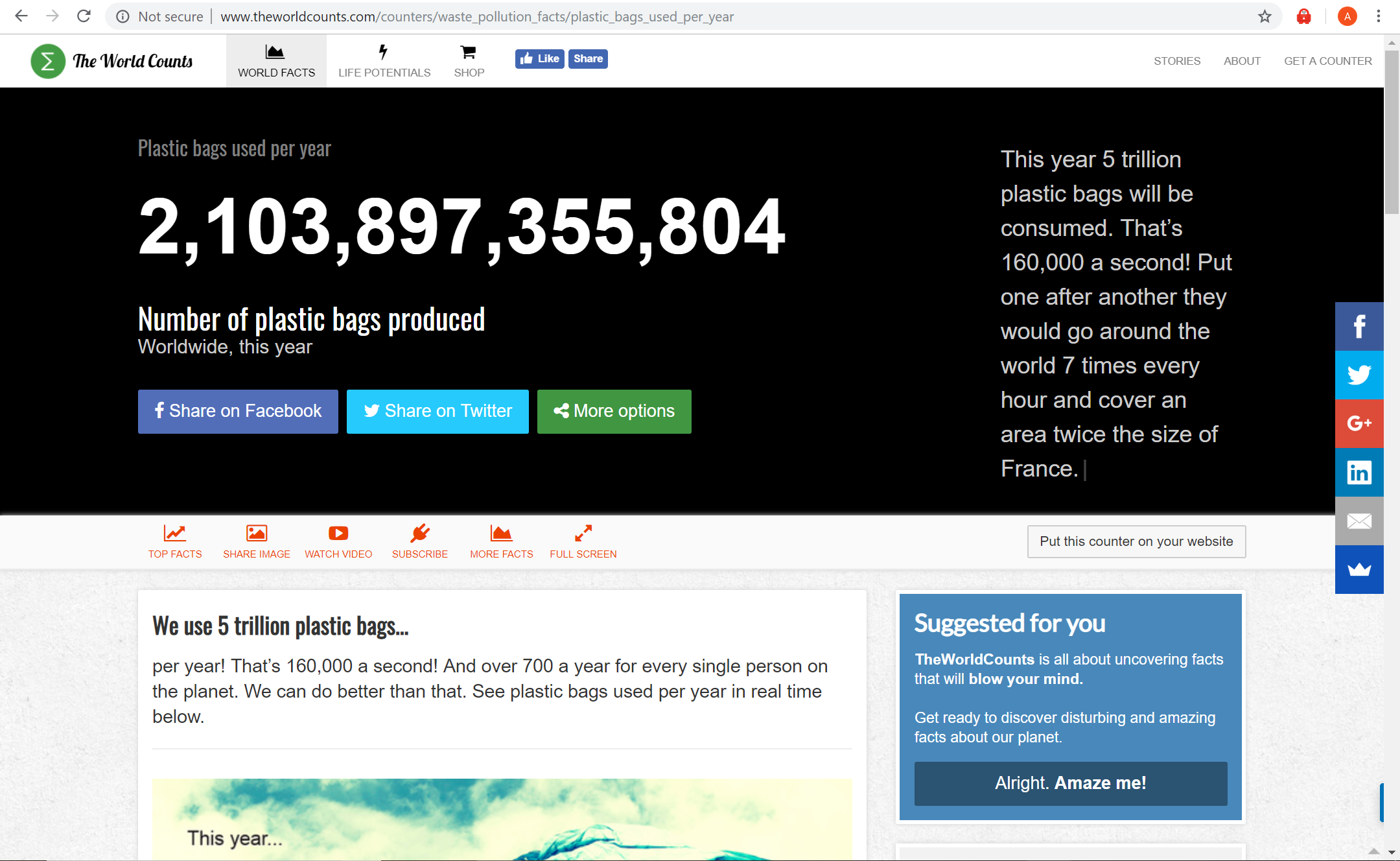
Plastic bags used per year Number of plastic bags produced – worldwide, this year. (n.d.). Retrieved from http://www.theworldcounts.com/counters/waste_pollution_facts/plastic_bags_used_per_year
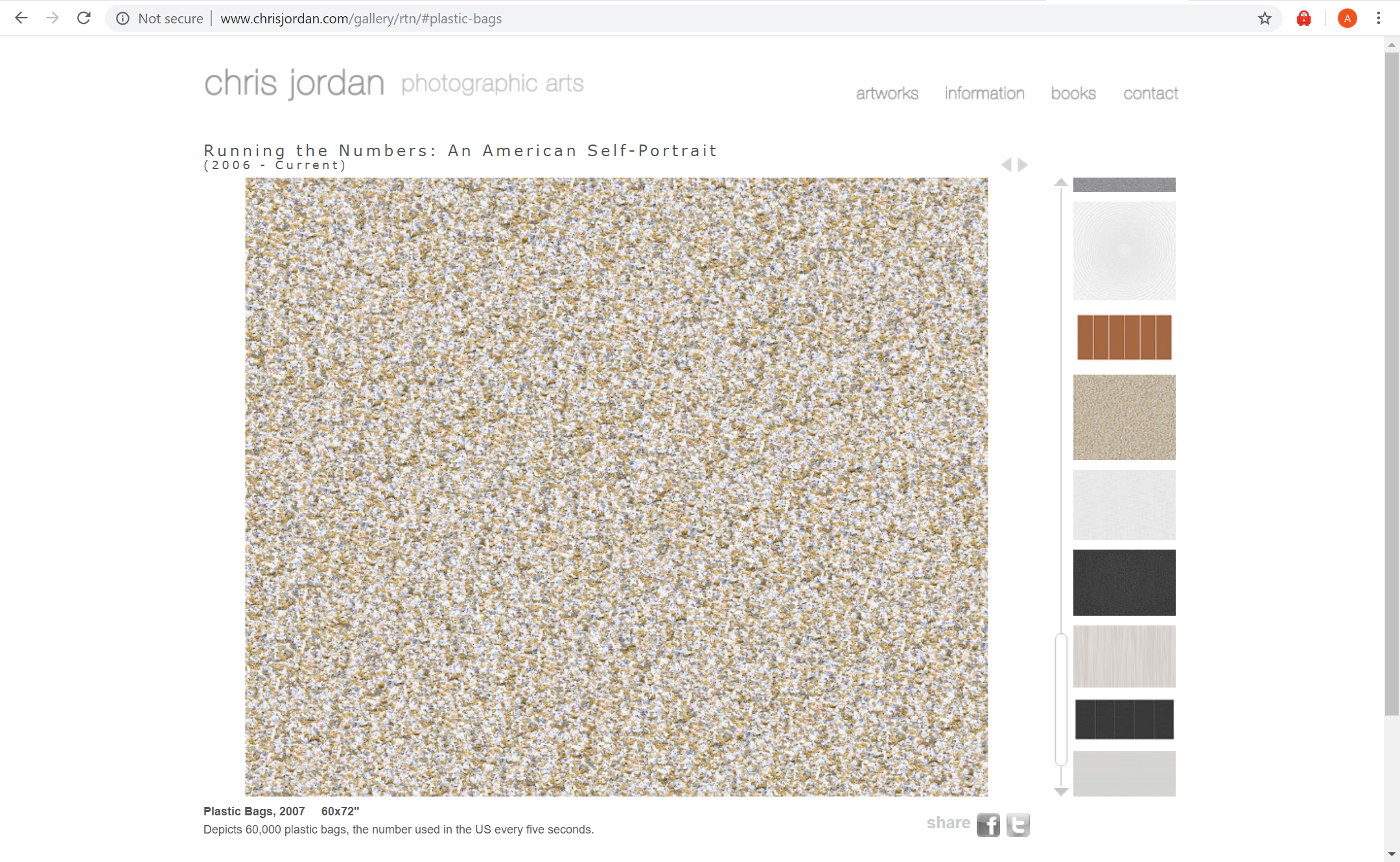
Chris Jordan Chris JordanRunning the Numbers. (n.d.). Retrieved from http://www.chrisjordan.com/gallery/rtn/#plastic-bags
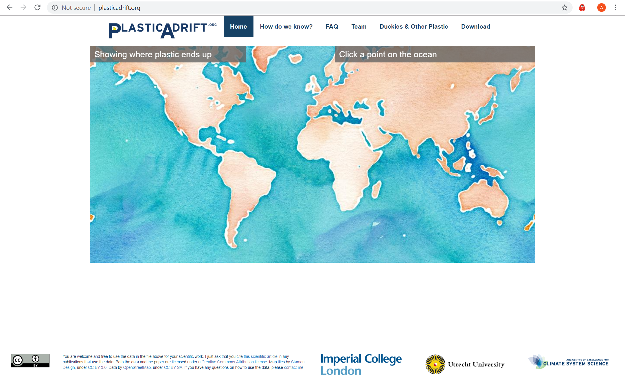
Plastic Adrift Plastic Adrift. (n.d.). Retrieved from http://plasticadrift.org/